Showing posts with label avian influenza. Show all posts

Saturday, July 19, 2014

Now for something (not so) completely different: H7N9 maps...

Now it's time to mess around with influenza A(H7N9) virus mapping using Tableau.

I've (only just) realised the my esteemed peer, Shane Granger has been using Tableau to do this for ages (see here), and that this will be duplicating his excellent work. So I'll try my best to consciously differentiate my maps from his - but there's only so far you can go with that and there will be overlap. 

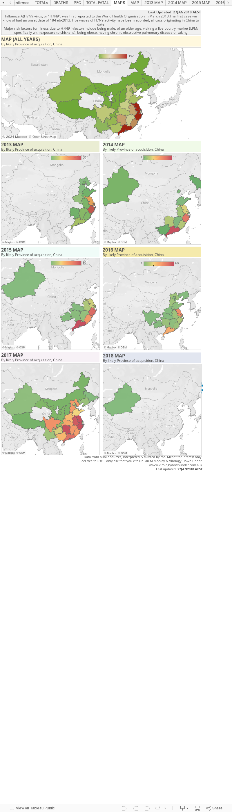
The page below is a very early first play with H7N9. It's just detections broken across 2013 and 2014, by province most likely to have been the source of the infections (as far as I can tell) in mainland China. 

If I can master this I'll try and add more details in the future. For now, these numbers a a little out of date but he trends are similar. This charts 449/452 detections.


Thursday, May 22, 2014

Snapdate: Avian influenza A(H7N9) virus...

There seem to have been more announcements of late than previously so I thought I'd plot this and see. 

These are a little adrift as the last 7 or so have not been through the WHO scrubbing process (which adds extra bits of data) so we will see a little shifting the last 2 or so blue dots on the chart below.
Click on image to enlarge.

Guangdong and Anhui provinces have the most active case generators in May.

Anhui province has reported 3 cases in a week and there seem to have been a constant stream of cases in May, but they they don't, in reality, seem to be out of what's become the ordinary in 2014 for a virus that is happily ticking over in several provinces.


Wednesday, May 7, 2014

Avian influenza A(H7N9) virus found in more than half of wet markets in Guangdong...

It comes as no surprise to me, but is still a very welcome piece of data, that Guangzhou's ongoing live bird markets and concurrent continued cases of H7N9 in people, are also happening in a an environment of 60% of market stalls tested positive for the virus in April.

A report in the South China Morning Post noted 
"Upon conclusion of the trial on September 30, the city government proposes gradually extending the ban, covering chickens, ducks, geese and pigeons, to other parts of the metropolis. The ban is expected to be implemented citywide by 2024."

"Currently, it affects 298 live poultry stalls at 82 wet markets in Yuexiu district, and in parts of Tianhe, Liwan and Panyu districts, where vendors will sell centrally slaughtered chickens that will be provided by three designated suppliers."
This is welcome news and a positive step towards stopping not just H7N9, but a raft of other influenza viruses that jump to us from, and mix to create new virus within, birds.

Source...
  1. http://www.scmp.com/news/china/article/1505389/guangzhou-begins-trial-ban-live-poultry

Monday, April 28, 2014

H7N9 Snapdate: some quick charts...

Click on image to enlarge.
I don't have a lot of time tonight so this is just a quick post of some updated charts with a few summaries of some key features of the influenza A(H7N9) virus situation in south-eastern China. At writing it was at 432 detections with media reporting 128 deaths

Click on image to enlarge.
Guangdong is where H7N9 is still most active and it is this province that is the source of the continued cases trickling off Wave 2's peak.

Most H7N9 cases overall have been in Zhejiang and Guangdong provinces but lately, post-peak of Wave 2, there has been continued activity in Jiangsu province including a recent healthcare worker with no mention of "contact with poultry"; the absence of which stands out in World Health Organisation (WHO) reports because most cases are followed by affirmation of that phrase.

Click on image to enlarge.

In  the  survival chart above we see that most of the fatal cases, shown in red, are defined by an older age. Unfortunately, a lot more of the fatalities have been reported through the media without identifying details (48 of 128), than have come through official Chinese channels and out via the WHO. This lack of detail makes it impossible to clearly link a lot of the deaths to the case announcements. Only the custodians of these data know what this chart should really look like. NB: Since making the chart this morning I've found a handful more case details at FluTrackers, but public detail on fatal cases remains the weakest of any of the H7N9 data.

Click on image to enlarge.
We can see in the weekly chart on the right that the two H7N9 waves differed in timing, the width of their bases (more cases in Wave 2) as well as how "tight" their peaks were. Wave 2 has tailed off, but continues to spit out cases, while Wave 1 comprised both a steep climb and a steep decline in human cases.
Click on image to enlarge.

If we zoom in on Wave 2 we can see by looking at cases per day in the chart on the left, that between 0-4 illness onsets per day are being reported, as they have been since late Feb-2014. 

Is this the legacy of those regions whose live bird markets remained open or were only shut temporarily for disinfecting and restocking? Those regions with markets that were shut for much longer, or for good, do not seem to have contributed much to the continuing leak of H7N9 infections despite being key contributors during the peak periods before markets were closed.

Click on image to enlarge.
In zooming in on Wave 2's cases by week, but this time based on the region of likely acquisition of infection, we see that Guangdong province (brown line) has been the most consistent contributor of human H7N9 infections both late during the 2nd of the Wave 2 peaks, but also after the peak's decline almost everywhere else in south-east China. There was considerable publicised unwillingness from poultry producers to permanently close markets in this Province, a location with a major role in the nations poultry production. And so this little experiment incubates further and I have little doubt we will see the impact of that unwilingness late in 2014. 

Click on image to enlarge.
As noted above, public H7N9 death data do not allow good linkage with official case announcement data for about 48 fatalities, so my second-last chart tonight uses both public and media-release numbers to try and illustrate how the proportion of fatal cases (PFC) has changed across both Waves. The PFC seems to be holding fairly steady now between 17% and 30% (depending on source of numbers).


Click on image to enlarge.
And finally we see that the age and sex distribution across all cases (both Waves) is skewed to wards older males. Same as usual. If we look at this distribution (ran out of time to put in here) for the fatal cases, it is much more tightly grouped around the >60-year olds, but that females appear to dominate males in deaths during Wave 2, whereas it was the other way around for Wave 1.

Saturday, April 19, 2014

Watching zoonoses evolve...

Special guest writer: @influenza_bio

For the first time in human history, we are watching diseases jump from animals to humans on a large scale. We've seen diseases appear for the first time in humans before; that's not new. We've seen HIV and several new strains of influenza emerge over the past century or so, for example. What is new is that we can now watch this process as it happens. We are able to watch animal diseases trickle case by case into humans, and we wonder whether any of these diseases might some day become human diseases. We wonder whether we might be watching pandemics develop in real time.

A disease that jumps from a non-human animal to a human (or the other way around) is called a "zoonotic" disease or a "zoonosis." Individual cases are called "zoonotic" cases. When a zoonotic disease is trying to make the jump to us permanent, we call this disease an "emerging infectious disease."

We have certainly been watching a lot of zoonotic MERS coronavirus and bird flu (e.g., H7N9 and H5N1) cases develop in people lately, along with Ebola virus cases. Zoonotic cases of other diseases, including infections with various strains of bird and swine flu, occasionally develop, as well, and are watched closely.

When the 2009 H1N1 flu pandemic started, we had no clue much beforehand that it was on its way.  We didn't even have surveillance data about swine flu strains that were even particularly close to the strain that emerged in us. A large animal flu surveillance gap blindsided us that year.

And we will undoubtedly be blindsided again by other emerging infectious diseases that we won't even see coming, although people are doing their best to see what's out there.

When an emerging infectious disease jumps to humans, it can cause either a relatively local outbreak or a worldwide outbreak, called a "pandemic." If a disease becomes a pandemic, that just means that it's spreading worldwide; the word "pandemic" doesn't imply anything about how bad the disease might or might not be. In some sense, the worst case can be when a disease jumps to humans and becomes "endemic" in humans, meaning that it gets established in people and regularly infects people, year after year. Endemic diseases can circulate worldwide (e.g., influenza) or in more restricted geographical regions (e.g., malaria).

Our knowledge and resources have grown to the extent that we are currently able to monitor some significant zoonotic outbreaks of disease. We are currently watching the MERS coronavirus and the influenza A(H7N9) virus both try to become human viruses.

Will either one succeed? We can't say. We've never watched this process happen before. We don't know how long such a process "usually" takes, or whether there even is a "usual" amount of time that it takes. We don't know how long it might take, or how quickly it has happened before. We doknow that the process is "stochastic," meaning that it involves a lot of chance. A pathogen that in one situation might cause a pandemic might just die out in another situation. Everything depends on the specific changes in a pathogen that get a chance to develop and on whether those changes end up getting passed on. We don't know how often pathogens "fail" when they "try" to make the jump to humans.

A lot of us have watched the recent surge in MERS coronavirus cases with some amount of concern. As of April 19, 2014, there are two large clusters of cases in the Middle East, and at least one of them is still growing. One cluster, in Jeddah, Saudi Arabia, now has 60 cases; 7 cases were added to this cluster today, and 6 were added yesterday. There are perhaps over a dozen cases in another cluster in the UAE. One patient who became ill with MERS in Jeddah at the end of March flew to his home country of Malaysia while ill and subsequently died in Malaysia; 79 of his contacts are now being watched closely in Malaysia. Test results are starting to come in for a number of these contacts, and thankfully all are negative for MERS so far. An asymptomatically infected Filipino health care worker traveled on an airplane back to the Philippines a few days ago. Yesterday, a MERS case was announced in Greece; a Greek man who had been living in Saudi Arabia was recently in Jeddah and presumably became infected there before flying back to Greece. He arrived in Greece with a fever; his contacts are now being monitored. In other words, MERS case numbers are growing quickly right now, at least in part through human-to-human transmission, and infected – and potentially infectious – patients are getting on airplanes to travel around the globe.

Does what we're seeing now represent changes in the virus that are making it more transmissible among humans? Or are we seeing a random fluctuation in the numbers of cases? Or, are we seeing more cases simply as a result of improved surveillance? I would argue that what we're seeing likely reflects one or more changes in the virus, simply because
  1. We've been seeing so many more symptomatic cases recently, 
  2. We've been seeing significantly larger clusters than we've ever observed before,
  3. A greater number of health care workers appear to be getting infected than ever before, and
  4. A greater proportion of cases are in health care workers than ever before. 
It's not that we've been seeing a rise only in the number of asymptomatic cases detected, which could suggest that we're only seeing the effects of improved surveillance. Moreover, while surveillance does seem to be picking up more mild and asymptomatic cases, it is difficult to know whether we are seeing more of these cases because of improved surveillance or because there simply are more such cases now. A lot of variables are being changed at the same time, and we don't have perfect information.

Nonetheless, the sheer numbers of recent cases suggest to me, at least, that the virus is changing and becoming more transmissible among humans. Until recently, we rarely saw evidence for human-to-human transmission of MERS; most cases may have been zoonotic. Now, however, large clusters involving roughly 1 to 4 dozen people are being seen, with single infected individuals infecting possibly up to a dozen or more other people. This is new. I don't think that we're seeing these clusters just as a result of improved surveillance, although I would be very happy to be wrong.

What does the future hold for MERS? We can't know. We might be watching MERS become a pandemic, and we might not. We might be watching the current relatively small MERS outbreak develop into a larger outbreak that eventually gets contained, as was seen with SARS. Or, the whole outbreak might all just simmer down or go away. Even if the virus were currently changing to become more transmissible, the current spate of cases could still simmer down or go away, just stochastically, just through sheer chance.

Prudence would dictate that we remain concerned and vigilant, however, especially as symptomatic MERS cases have had an approximately 40% case fatality rate (CFR). If MERS did cause one or more wider outbreaks in humans, that CFR might or might not change. Even if the CFR dropped to 10% of what it is now, it would still be on the same scale as the CFR for the 1918-19 influenza pandemic.

As a global society, we have an obligation to do everything in our power to prevent the MERS coronavirus from causing larger disease outbreaks in humans. We need more surveillance in affected countries, including much more genetic sequence data. And in countries of the Arabian Peninsula that are currently detecting MERS cases, infection control procedures need to be improved to the point where nosocomial cases in health care workers and patients are prevented. Health care workers in other countries should be educated about the possibility of MERS patients arriving from afar and about how to treat such patients safely. If this virus becomes more transmissible, we should not be caught unprepared. We can see this one coming.
Monday, March 24, 2014

Avian influenza A(H7N9) virus cases hit 400

While everyone was looking at Guinea and the Ebola Zaire outbreak, that stealthy H7N9 has gone and infected a total of 400 people that we know of. It is of course, just another milestone and not an indication of anything changed about the virus. In fact the trend for few cases per day is continuing. One constant in s sea of change and new things.

Another constant, the up-to-date nature of the FluTrackers case list - check it out here

I have to run - much to learn about Ebola!

References...

  1. FluTrackers H7N9 case list
    http://www.flutrackers.com/forum/showthread.php?t=202713


Tuesday, March 18, 2014

Any differences in the sex of avian influenza A(H7N9) virus cases in different areas of China?

a) Male (blue) and female (lavender) lab-confirmed H7N9 human cases broken into the Province or Municipality of likely acquisition. b) The proportion of total H7N9 positives at each site of acquisition that are female (lavender).  The proportion of females in Wave 1 (Range of weeks beginning 18-Feb-13 to 20-May-12) and Wave 2 (07-Oct-13:current) are also shown as a horizontal line for comparison.
Click on chart to enlarge.


This new chart idea was just a look-see at whether there is anything out of the ordinary about the sex distribution of H7N9 human cases in the different areas of China. These are total numbers from both Waves of H7N9 season.

I've included case numbers in Part a) as well as proportion of females in part b) to show that a value of 100% must be place in context of only 1 POS!

Nothing much to see here folks.


Saturday, March 15, 2014

H7N9: the dotted lines that make sense of things...[CORRECTED]

Click on image to enlarge.
The latest H7N9 case-per-day chart shows that the trickle of human cases of confirmed avian influenza A(H7N9) virus infection is becoming a drip. The tap? My money is still mostly with the market closures. What precisely in the markets is the source of human H7N9 acquisition? Dunno, but the consensus seems to be poultry; songbirds also look pretty good though. It doesn't have to be, and is unlikely to be, just 1 thing of course. We know that this virus, as with other avian influenza viruses, can be shared around among bird species. It can even go into a human and that isolate be used to infect a bird again. See my recent post on some of this.


Click on image to enlarge.
What's also particularly intriguing, among the many interesting aspects of H7N9's acquisition and spread among humans, is that we're seeing much more "shouldering" in the Wave 2 epidemic curve than we did in Wave 1's.

Instead of the precipitous decline we saw back in 2013, we're seeing a drop down to ~10 cases per day, but then a slower decline the rest of the way. Is this because we started human cases from more sites this time around?; because markets took longer to close after the cases numbers began to climb?; is it related to markets being closed at different times, in different ways, in different locales? Who knows?
Cases by region acquired, per week, with different
 regions highlighted by coloured lines and the 
total case number in the background (grey).
Wave 1 and Wave 2.
Click on image to enlarge.

Dr Katherine Arden suggested I have a look at what's happening in each Province or Municipality and see whether any particular place can shoulder the blame for the shouldering. And that does seem to be the case if you look at the adjacent chart. Guangdong province seems to be the major culprit contributing to the shoulder effect. 


Cases by region acquired, per week, with different
 regions highlighted by coloured lines and the
total case number in the background (grey).
Wave 2 only.
Click on image to enlarge.
In the zoomed-in version that focusses on Wave 2 alone, we can see that the Wave 2 "peak" has in fact 2 peaks; the 1st peak dominated by Zhejiang province cases and the 2nd driven by a surge in Guangdong provincial cases. Guangdong cases took longer to drop away, and are in fact still being reported, possibly because the major poultry markets there were closed later than in Shanghai and Zhejiang province and only temporarily for a clean. Or perhaps the bird outbreak @influenza_bio and I discussed has a source in Guangdong province?

It's all speculation beyond the data we can actually plot.

Wednesday, March 12, 2014

The decline of H7N9 Wave 2: some thoughts on why it may be different from Wave 1...

Influenza virus and influenza the disease certainly give scientists a run for their limited money when it comes to predicting what either will do from year-to-year, country-to-country or outbreak-to-outbreak. 

And just when you think you know enough, things change. 

This morning my Twitter stream was fed by a sparkling rivulet of informed comment by @influenza_bio ("A biologist"follow him if you don't already) on the subject of why H7N9 cases are falling. @influenza_bio groups together a few great points:
  1. H7N9 cases are declining.
    Agreed, I think Wave 2 ended almost a month ago.
  2. Overall, influenza-like illness (ILI) visits in China have declined.
    A clear parallel, but is it causal? ILIs provide a general guide to influenza circulation (general, because other viruses cause ILI which is basically fever + upper and or lower respiratory signs and symptoms - so a very broad but useful good guide
  3. Is the drop in human H7N9 cases linked to the end of a (silent) outbreak in birds (poultry, waterbirds, songbirds, both...)?
    Finding data on specific bird migration dates in the region is difficult. See here and here for some generalizations. Seems very reasonable.
  4. Live bird market closures cannot be the only cause of a drop in H7N9 cases otherwise we'd expect to see cases in other areas continue to rise (presumably areas where markets are not closed).
    If we compare Zhejiang to Guangdong, then we can see that the delay in closing Guangdong's bird markets seems to have manifested as a delay in slowing of human cases; most recent H7N9 case acquisitions have indeed been in Guangdong (a major poultry producing area in southern China) whereas cases in Zhejiang which, like other eastern coastal regions shut their markets earlier and "permanently", generally speaking, have dried up.
  5. If H7N9 human case decreases were linked solely to weather, then how could we explain the peak in 2013 which extended into late April whereas it looks to have peaked well before that, in early Feb, in 2014?
    Given that the seasons have not differed between the years (or have they?), I'd suggest we look more at the start of the 2 Waves; Wave 2 commenced earlier in 2014 than did Wave 1 in 2013, but the precipitous decline of both outbreaks of human notifications seemed to have been more closely tied to market closures than dates on a calendar. Of course markets are stocked with H7N9 infected birds and that which links to outbreaks at the supply end unless poultry acquired their infections at markets and then spread that between markets by bird movements which can extend right across southeast China. Why did it start earlier is a key question for me.
@influenza_bio finishes with the comment that...

As I've learned from @influenza_bio, many factors go into humans acquiring a particular influenza virus at a particular time/season, and probably no single thing is responsible for all events for any given outbreak. Phew. But that's why we don't have influenza infections all the time and it underpins why they peak at a certain time.

Human acquisition of influenza virus is related to:

  • How a person is exposed to the virus (aerosol from upper respiratory tract coughs and sneezes or self-inoculation from contact with contaminated surfaces)
  • Whether the virus survives long enough to be inhaled/self inoculated which is in turn linked to virus subtype and strain and environmental temperature and humidity (see some more on that in a guinea pig model here)
  • The host and their immune state and general health, smoking, underlying diseases etc
  • How much virus enters the host and where it "lands" and makes a footing in the host's respiratory tract
  • The spaces we share with infected people and how fast and well the air is filtered/exchanged in those spaces
  • The virus subtype in terms of what receptor it prefers and where those might be located throughout the respiratory tract.
  • For avian influenza in humans there is also the type and length of exposure to the animal hosts and their environment

Not an all inclusive list I'm sure, but you get the point. Influenza viruses are a complex beast, made more so by the fact that any given subtype could be represented by a range of strains indicating a variety of stabilities, preferences for receptors, antiviral susceptibilities etc. 

So I complete agree with @influenza_bio, more bird surveillance would indeed be a very important step in understanding what is happening in and perhaps predicting the risk of, human outbreaks of this and other avian influenza viruses.

Tuesday, March 11, 2014

An update on avian influenza A(H7N9) virus cases in humans: Week 56

As we currently stand (this minute), there are 389 laboratory confirmed human cases of infection including perhaps 122 deaths (31% PFC). 

H7N9 cases are mostly noted in older males (Average age 54-years; Wave 1 57-years; Wave 2 53-years) with the major risk being exposure to birds and "poultry markets" (commas because it is not just poultry being sold at these markets). No sustained human-to-human transmission has been noted and no specific vaccine exists although one is coming soon apparently. Oseltamivir or zanamivir are useful antivirals while adamantanes are of no use because H7N9 is resistant. to them. The second wave has peaked but we are still seeing a shoulder off the main peak from Wave 2; smaller numbers of cases each week (no longer occurring every day), often from regions other than those with closed poultry markets or with only recently closed or temporarily closed markets.


First chart.
Click on chart to enlarge.
First chart: where is H7N9? It's in Southeast China, most cases having been acquired in Zhejiang province (139/389 cases; 36%) during both Waves of human infection and Guangdong province is currently a very close second place (95/389 cases; 24%).


Second chart.
Click on chart to enlarge.
Second chart: where has H7N9 been focused over time? We can see from this chart that Zhejiang and Guangdong provinces have accrued H7N9 cases most rapidly. While Zhejiang featured in both waves, Guangdong is of Wave 2. It will be interesting to see what happens if there is a Wave 3; without finding and controlling the source of human acquisitions and if the birds with the virus continue to have the virus, I expect we will see future waves.


Third chart.
Click on chart to enlarge.
Third chart: the waves of an outbreak. Wave 1 was 2013 while Wave 2 started in Oct-2013 but really kicked off in Jan-2014. Cases dived in Feb-2014 but there are still sporadic cases being reported each week. The Week (#53) beginning 17-Feb-2014 saw 8 cases followed by 7, 4 and 0 for subsequent weeks. Keeping in mind that there are around 4-12-days (currently averaging 8-days overall) between onset of illness and when a case get confirmed by a laboratory (or reported publicly if no specific lab date is available), we may see a few more cases assigned to the last week of February yet.


Fourth chart.
Click on chart to enlarge.
Fourth chart: Age and sex of H7N9 cases. The age pyramid shows a decidedly upside down pyramid indicating that H7N9 disease is one of the older age bands. It also shows that it is a disease of men morseo than women.


Fifth chart.
Click on chart to enlarge.
Fifth chart: age by week and proportion female. This is an interesting one. There was a dip in the proportion of female cases for the week the week beginning in 3-Feb (right hand y-axis) which bounced back up a week or two later. 

Sixth chart.
Click on chart to enlarge.
Sixth chart: H7N9 cases per day and the rolling average. The decline in Wave 2 cases continues with multiple recent days recently in which no new cases occurred.

Wednesday, March 5, 2014

Influenza and chips: tracking bird movements using transmitters

Understanding bird migration is one important aspect to better understanding of influenza viruses. This is because water birds, including ducks, geese, swans, gulls, terns and waders are natural hosts for low pathogenicity avian influenza viruses (LPAI). High pathogenicity avian influenza (HPAI) viruses are mostly assembled in/found in poultry.

Little detail exists on the extent of wild bird movements from wintering areas to breeding grounds and back again, in both hemispheres. An interactive map that presents some of those data addresses some of this.  The map is located on a Food and Agriculture Organization of the United Nations (UNFAO) and United States Geological Survey (USGS; (1)) website here.

While this map does not include analysis of bird movements further southwards, it is clear that the tracked birds have distinct origins and endpoints. There is also visible overlap between different bird's flyways and endpoints. Such overlap represents chances for different viral passengers to be shed and acquired by the migrating birds, resulting in the production of new influenza virus subtypes and variants. At these endpoints there is also the possibility of local birds, poultry, pigs and perhaps other animals being infected by the visiting birds, also creating the possibility for new viral subtypes and variants to result.

Bird migration clearly involves countries all over the world. It is also seasonal. So just how big is the role for water bird movements in the "seasonality" of influenza outbreaks among poultry? I don't know but the answer is influenced by additional variables including the species and age of the birds, their interactions, their previous exposures to influenza viruses, health and immune status, differences between how and where wild birds exist, how and where poultry are farmed and caged and the health and environmental factors affecting virus survivability including humidity and temperature

From our human point of view, we sit at various points along this migratory transmission/acquisition chain, and that shows up when viruses spillover to us and cause overt disease. 

Amazing it doesn't happen more often really.


Links of interest...
  1. FAO-USGS Avian Influenza Projects at the USGS WERC
    http://www.werc.usgs.gov/ResearchTopicPage.aspx?id=17
  2. H7N9 in wild birds...a review of the literature (VDU post)
  3. http://virologydownunder.blogspot.com.au/2013/09/h7n9-in-wild-birdsa-review-of-literature.html
  4. UN FAO Avian influenza telemetry studies
    http://www.fao.org/avianflu/en/wildlife/sat_telemetry.htm
  5. Persistence of highly pathogenic avian influenza viruses in natural ecosystems.
    http://wwwnc.cdc.gov/eid/article/16/7/pdfs/09-0389.pdf