Showing posts with label influenza. Show all posts

Monday, September 29, 2014

The numbers are underestimates...

Ebola virus numbers.

Sorry but D'uh - yes the numbers during the Ebola virus disease (EVD) outbreak happening since December in Guinea then progressing to Sierra Leone, Liberia, Nigeria and Senegal....are an underestimate. 

Of course they are! 

How could they possibly not be?

Have you not watched a single documentary or news video detailing how heartbreakingly difficult it is to visit and help the people of West Africa, to characterize and gather those case numbers, to take, transport and test samples?

The suspect cases are an underestimate. 
The probable cases are an under-estimate. 
The fatal cases are an under-estimate. 

The only thing that is spot on is the laboratory confirmation numbers, because they are what they were when someone wrote them down having had some semblance of control over the steps to acquire them. 

But let's put that underestimation into context. 

"The tip of the iceberg"
Image originally provided by Gregory Haertl, WHO.
Click to enlarge
Influenza case numbers each year are also an under-estimate. 

In fact, some of those, the subtyping numbers, are deliberately so because it's too expensive and wasteful to subtype every single laboratory confirmed case - so a sample of cases are tested and that is assumed to reflect the subtype distribution for that region during that period. 

But seasonal influenza case numbers as a whole are a huge underestimate. Influenza does not drive everyone to a general practitioner nor to a hospital. Some infections with influenza virus don't even produce noticeable symptoms at all. They are still infections. They just don't get counted. So influenza A virus, possibly the most tracked of any respiratory virus, is underestimates. And that's okay. 

Well, measles too, in the respiratory virus department. 

The latest big bad is the species D enterovirus 68 (EV-D68). But the paltry few detections of it (identified by genotyping) that have reported across the United States are likely a monstrous underestimate. In fact we have very little idea of a normal denominator for EV-D68 detections so it's hard to even know if 2014 is seeing all that big a change in its spread and distribution. Usually the enteroviruses (includes rhinoviruses) cause common cold-like illnesses and only get sought out in the great detail from a research point of view.

Middle East respiratory syndrome coronavirus (MERS-CoV) cases or the emerging influenza A(H7N9) virus cases are all underestimated as well. 

The population of your state or country is an underestimate too you know?

This is because we cannot capture every single case of infection, or person, at once. 

So the next time you are about to say "the WHO numbers are an underestimate" as if that is a revelation or an unexpectedly horrible thing you can also lay at their doorstep - please just don't. It's not smart, new or unusual.

You might as well say the world is round; underestimation of infection numbers is just that well established a fact. It's just by how much, and frankly that doesn't even matter too much because the trends can usually be easily seen, or quickly extrapolated.

Perhaps you did not know all that before. But if you have read to here, you do now.

Saturday, July 19, 2014

Now for something (not so) completely different: H7N9 maps...

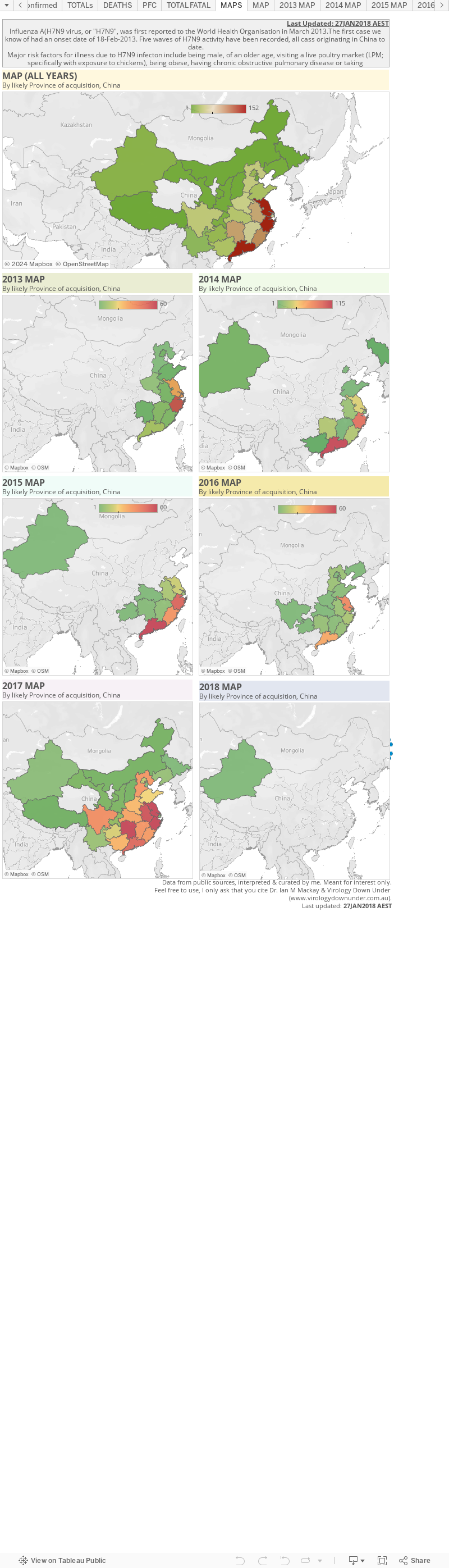
Now it's time to mess around with influenza A(H7N9) virus mapping using Tableau.

I've (only just) realised the my esteemed peer, Shane Granger has been using Tableau to do this for ages (see here), and that this will be duplicating his excellent work. So I'll try my best to consciously differentiate my maps from his - but there's only so far you can go with that and there will be overlap. 

The page below is a very early first play with H7N9. It's just detections broken across 2013 and 2014, by province most likely to have been the source of the infections (as far as I can tell) in mainland China. 

If I can master this I'll try and add more details in the future. For now, these numbers a a little out of date but he trends are similar. This charts 449/452 detections.


Monday, April 28, 2014

H7N9 Snapdate: some quick charts...

Click on image to enlarge.
I don't have a lot of time tonight so this is just a quick post of some updated charts with a few summaries of some key features of the influenza A(H7N9) virus situation in south-eastern China. At writing it was at 432 detections with media reporting 128 deaths

Click on image to enlarge.
Guangdong is where H7N9 is still most active and it is this province that is the source of the continued cases trickling off Wave 2's peak.

Most H7N9 cases overall have been in Zhejiang and Guangdong provinces but lately, post-peak of Wave 2, there has been continued activity in Jiangsu province including a recent healthcare worker with no mention of "contact with poultry"; the absence of which stands out in World Health Organisation (WHO) reports because most cases are followed by affirmation of that phrase.

Click on image to enlarge.

In  the  survival chart above we see that most of the fatal cases, shown in red, are defined by an older age. Unfortunately, a lot more of the fatalities have been reported through the media without identifying details (48 of 128), than have come through official Chinese channels and out via the WHO. This lack of detail makes it impossible to clearly link a lot of the deaths to the case announcements. Only the custodians of these data know what this chart should really look like. NB: Since making the chart this morning I've found a handful more case details at FluTrackers, but public detail on fatal cases remains the weakest of any of the H7N9 data.

Click on image to enlarge.
We can see in the weekly chart on the right that the two H7N9 waves differed in timing, the width of their bases (more cases in Wave 2) as well as how "tight" their peaks were. Wave 2 has tailed off, but continues to spit out cases, while Wave 1 comprised both a steep climb and a steep decline in human cases.
Click on image to enlarge.

If we zoom in on Wave 2 we can see by looking at cases per day in the chart on the left, that between 0-4 illness onsets per day are being reported, as they have been since late Feb-2014. 

Is this the legacy of those regions whose live bird markets remained open or were only shut temporarily for disinfecting and restocking? Those regions with markets that were shut for much longer, or for good, do not seem to have contributed much to the continuing leak of H7N9 infections despite being key contributors during the peak periods before markets were closed.

Click on image to enlarge.
In zooming in on Wave 2's cases by week, but this time based on the region of likely acquisition of infection, we see that Guangdong province (brown line) has been the most consistent contributor of human H7N9 infections both late during the 2nd of the Wave 2 peaks, but also after the peak's decline almost everywhere else in south-east China. There was considerable publicised unwillingness from poultry producers to permanently close markets in this Province, a location with a major role in the nations poultry production. And so this little experiment incubates further and I have little doubt we will see the impact of that unwilingness late in 2014. 

Click on image to enlarge.
As noted above, public H7N9 death data do not allow good linkage with official case announcement data for about 48 fatalities, so my second-last chart tonight uses both public and media-release numbers to try and illustrate how the proportion of fatal cases (PFC) has changed across both Waves. The PFC seems to be holding fairly steady now between 17% and 30% (depending on source of numbers).


Click on image to enlarge.
And finally we see that the age and sex distribution across all cases (both Waves) is skewed to wards older males. Same as usual. If we look at this distribution (ran out of time to put in here) for the fatal cases, it is much more tightly grouped around the >60-year olds, but that females appear to dominate males in deaths during Wave 2, whereas it was the other way around for Wave 1.

Saturday, April 19, 2014

Watching zoonoses evolve...

Special guest writer: @influenza_bio

For the first time in human history, we are watching diseases jump from animals to humans on a large scale. We've seen diseases appear for the first time in humans before; that's not new. We've seen HIV and several new strains of influenza emerge over the past century or so, for example. What is new is that we can now watch this process as it happens. We are able to watch animal diseases trickle case by case into humans, and we wonder whether any of these diseases might some day become human diseases. We wonder whether we might be watching pandemics develop in real time.

A disease that jumps from a non-human animal to a human (or the other way around) is called a "zoonotic" disease or a "zoonosis." Individual cases are called "zoonotic" cases. When a zoonotic disease is trying to make the jump to us permanent, we call this disease an "emerging infectious disease."

We have certainly been watching a lot of zoonotic MERS coronavirus and bird flu (e.g., H7N9 and H5N1) cases develop in people lately, along with Ebola virus cases. Zoonotic cases of other diseases, including infections with various strains of bird and swine flu, occasionally develop, as well, and are watched closely.

When the 2009 H1N1 flu pandemic started, we had no clue much beforehand that it was on its way.  We didn't even have surveillance data about swine flu strains that were even particularly close to the strain that emerged in us. A large animal flu surveillance gap blindsided us that year.

And we will undoubtedly be blindsided again by other emerging infectious diseases that we won't even see coming, although people are doing their best to see what's out there.

When an emerging infectious disease jumps to humans, it can cause either a relatively local outbreak or a worldwide outbreak, called a "pandemic." If a disease becomes a pandemic, that just means that it's spreading worldwide; the word "pandemic" doesn't imply anything about how bad the disease might or might not be. In some sense, the worst case can be when a disease jumps to humans and becomes "endemic" in humans, meaning that it gets established in people and regularly infects people, year after year. Endemic diseases can circulate worldwide (e.g., influenza) or in more restricted geographical regions (e.g., malaria).

Our knowledge and resources have grown to the extent that we are currently able to monitor some significant zoonotic outbreaks of disease. We are currently watching the MERS coronavirus and the influenza A(H7N9) virus both try to become human viruses.

Will either one succeed? We can't say. We've never watched this process happen before. We don't know how long such a process "usually" takes, or whether there even is a "usual" amount of time that it takes. We don't know how long it might take, or how quickly it has happened before. We doknow that the process is "stochastic," meaning that it involves a lot of chance. A pathogen that in one situation might cause a pandemic might just die out in another situation. Everything depends on the specific changes in a pathogen that get a chance to develop and on whether those changes end up getting passed on. We don't know how often pathogens "fail" when they "try" to make the jump to humans.

A lot of us have watched the recent surge in MERS coronavirus cases with some amount of concern. As of April 19, 2014, there are two large clusters of cases in the Middle East, and at least one of them is still growing. One cluster, in Jeddah, Saudi Arabia, now has 60 cases; 7 cases were added to this cluster today, and 6 were added yesterday. There are perhaps over a dozen cases in another cluster in the UAE. One patient who became ill with MERS in Jeddah at the end of March flew to his home country of Malaysia while ill and subsequently died in Malaysia; 79 of his contacts are now being watched closely in Malaysia. Test results are starting to come in for a number of these contacts, and thankfully all are negative for MERS so far. An asymptomatically infected Filipino health care worker traveled on an airplane back to the Philippines a few days ago. Yesterday, a MERS case was announced in Greece; a Greek man who had been living in Saudi Arabia was recently in Jeddah and presumably became infected there before flying back to Greece. He arrived in Greece with a fever; his contacts are now being monitored. In other words, MERS case numbers are growing quickly right now, at least in part through human-to-human transmission, and infected – and potentially infectious – patients are getting on airplanes to travel around the globe.

Does what we're seeing now represent changes in the virus that are making it more transmissible among humans? Or are we seeing a random fluctuation in the numbers of cases? Or, are we seeing more cases simply as a result of improved surveillance? I would argue that what we're seeing likely reflects one or more changes in the virus, simply because
  1. We've been seeing so many more symptomatic cases recently, 
  2. We've been seeing significantly larger clusters than we've ever observed before,
  3. A greater number of health care workers appear to be getting infected than ever before, and
  4. A greater proportion of cases are in health care workers than ever before. 
It's not that we've been seeing a rise only in the number of asymptomatic cases detected, which could suggest that we're only seeing the effects of improved surveillance. Moreover, while surveillance does seem to be picking up more mild and asymptomatic cases, it is difficult to know whether we are seeing more of these cases because of improved surveillance or because there simply are more such cases now. A lot of variables are being changed at the same time, and we don't have perfect information.

Nonetheless, the sheer numbers of recent cases suggest to me, at least, that the virus is changing and becoming more transmissible among humans. Until recently, we rarely saw evidence for human-to-human transmission of MERS; most cases may have been zoonotic. Now, however, large clusters involving roughly 1 to 4 dozen people are being seen, with single infected individuals infecting possibly up to a dozen or more other people. This is new. I don't think that we're seeing these clusters just as a result of improved surveillance, although I would be very happy to be wrong.

What does the future hold for MERS? We can't know. We might be watching MERS become a pandemic, and we might not. We might be watching the current relatively small MERS outbreak develop into a larger outbreak that eventually gets contained, as was seen with SARS. Or, the whole outbreak might all just simmer down or go away. Even if the virus were currently changing to become more transmissible, the current spate of cases could still simmer down or go away, just stochastically, just through sheer chance.

Prudence would dictate that we remain concerned and vigilant, however, especially as symptomatic MERS cases have had an approximately 40% case fatality rate (CFR). If MERS did cause one or more wider outbreaks in humans, that CFR might or might not change. Even if the CFR dropped to 10% of what it is now, it would still be on the same scale as the CFR for the 1918-19 influenza pandemic.

As a global society, we have an obligation to do everything in our power to prevent the MERS coronavirus from causing larger disease outbreaks in humans. We need more surveillance in affected countries, including much more genetic sequence data. And in countries of the Arabian Peninsula that are currently detecting MERS cases, infection control procedures need to be improved to the point where nosocomial cases in health care workers and patients are prevented. Health care workers in other countries should be educated about the possibility of MERS patients arriving from afar and about how to treat such patients safely. If this virus becomes more transmissible, we should not be caught unprepared. We can see this one coming.

Thursday, April 3, 2014

Can we believe every H7N9 seroprevalence study we see?

Special Guest writer: @influenza_bio

A little over a year ago, the first known human patient got sick with avian influenza virus(H7N9). The number of H7N9 cases rose and fell in the spring of 2013, and a total of 134 people were known to have contracted H7N9 before June, 2013. Since then, sporadic cases appeared in the summer and fall, and by the end of December, 2013, new cases started to pick up again. We have now seen a second wave rise and fall, although several new cases still being reported each week. As of the time of this writing, just over 400 people are known to have been infected with H7N9. The case fatality rate (CFR) – roughly speaking, the percentage of people infected with H7N9 who die from it – for these known cases is almost 40%.

One question that is on a lot of people's minds is, how many other H7N9 cases are out there that we don't know about? How many mild cases are there that never get tested? How many asymptomatic cases are there that are missed? If there were a lot of undetected cases out there, that would mean that H7N9 is a lot less fatal than the known cases would make us think. On the other hand, if we were somehow miraculously seeing every single actual case, then the CFR would be as bad as all of these cases make it out to be. (And imagine what the CFR would be like without hospitals, ventilators and oseltamivir!)

How do we find out if there are cases that we're missing? One way is to do what is called a seroprevalence study. This means collecting blood samples from as wide a swath of a population as possible and testing to see how many of these samples have antibodies to H7N9. Antibodies are molecules that are made by cells of the immune system and that stick to specific pathogens to help our bodies to rid themselves of these pathogens. If someone gets sick with H7N9 influenza, his or her body would most likely continue to produce a significant amount of antibodies specifically against that strain for at least a good number of months after infection and possibly much longer. In general, people who are infected with influenza but who do not develop symptoms will also produce such antibodies, but their bodies will make fewer of them, and, on average, they won't make as many of them for as long. We don't know exactly what the pattern of antibody production is for people who are infected with H7N9 but don't develop symptoms, though, because researchers haven't identified enough of these individuals to study.

It is very important that we get these seroprevalence studies right. If they're done wrong and we miss a lot of cases, then we will simultaneously underestimate how common H7N9 cases are and overestimate how deadly the strain is. On the other hand, if seroprevalence studies are done wrong and we think a lot of people were infected with H7N9 when they weren't, then we will overestimate how common H7N9 cases are but underestimate how deadly the strain is. Facts can help us to respond to H7N9, and if we get the facts wrong, then we can't respond properly. For example, if we come to think mild H7N9 cases are far more numerous than the severe ones that actually get diagnosed, then we might not worry as much about H7N9 as we should.

What I'd like to talk about here are some of the important ways that seroprevalence studies can go wrong. To answer my title question, no, we cannot always believe the conclusions of every seroprevalence study we see. Scientists make mistakes, just like everyone else, and sometimes things just go wrong, too. I'd like for you to understand just how some of these mistakes can arise, so that you can better judge for yourself whether a study is likely to be reliable or not, or so that you can at least know that there are things out there that can go wrong.

How are seroprevalence studies done?

There are 2 types of laboratory assays (tests) that are usually used in seroprevalence studies (although there are others): hemagglutination inhibition (HI) assays1and microneutralization (MN) assays.2 (For more information about the HI assay in general, see a nice description by Dr. Racaniello.3) MN assays are considered better (more sensitive and specific) than HI assays, but they are harder to do. MN assays require a significant amount of extra work at the end that HI assays don't. But, more importantly for H7N9 studies, HI assays can be done with either "killed," modified or "live" virus, whereas MN assays require "live" H7N9 virus. In other words, HI assays can be done in almost any lab, but MN assays require a BSL-3 lab. A neutralization assay4 has been developed that uses a "pseudovirus" instead of live H7N9 and is therefore far less hazardous to work with, but formal WHO diagnostic criteria still require standard HI and/or MN assays.

First, blood samples are collected. Each blood sample is drawn into a tube, and after 15-30 minutes, the tube is centrifuged to separate clotted red blood cells from the rest of the blood. The red blood cells are discarded; what's left is called serum, and that's what's studied. The serum samples should then be put in a refrigerator if they'll be studied within a few days; if they'll be studied later, they should be frozen. Once a researcher is ready to study the serum samples, the serum samples are thawed. Virus is also used for the assay, so one or more tubes of virus are thawed, too. Different types of mammalian or bird cells are prepared: typically horse, turkey or chicken red blood cells for HI assays, or a special type of dog kidney cells ("MDCK" cells) for MN assays. Various solutions are prepared. Serum samples, virus preparations and cells are diluted as needed, and everything is transferred into little wells in a plastic "plate" in just the right way. In the HI assay, the plate then sits at room temperature for 1 hour, after which it is "read" by eye. In the MN assay, the plate then sits at 37°C (body temperature) for 19-21 hours, after which it is read by a machine (an "ELISA reader"). The assay is done. The results of the assay are then written down and analyzed, and voilà, a paper appears in the scientific literature.

What could possibly go wrong with these blood tests?


Let's start with some things that can go wrong with the lab work:
  1. If blood samples are left sitting around for a long time without being centrifuged, the red blood cells will start to break apart, and enzymes released from the red blood cells will start to destroy antibodies (and everything else) in the blood samples. This happens even faster if blood samples are not refrigerated.
  2. If serum samples are left in the fridge too long, things can start to deteriorate, just like food in your fridge would. The antibodies that you would like to measure start to be broken down. (Sometimes, for many different kinds of studies, people study serum samples left over after patients' blood tests at hospitals. Those samples sometimes sit around in a fridge for quite a while. Some of them can even be green from stuff growing in them while they're sitting around. Yuck.)
  3. If plasma (what's left in blood after unclotted red blood cells are removed) is used instead of serum (what's left in blood after clotted red blood cells are removed), then the assay can read artificially high. Serum should always be used, not plasma.
  4. Every time serum is frozen and thawed, some of the antibodies are effectively destroyed. This should not be done over and over. Serum samples should be put into the right size tubes that the researcher will want to use, so that the samples are put through only 1-2 "freeze-thaw cycles" before they are tested. And all serum samples should go through the same number of freeze-thaw cycles.
  5. The same thing is true for virus samples used in MN assays. A single freeze-thaw cycle can reduce virus infectivity by a factor of 10. Virus samples also need to be kept on ice when they're being worked with.
  6. The plate can be read wrong. It's hard to imagine reading an HI assay plate wrong, but a special procedure (ELISA) and special equipment (ELISA plate reader) are used in the MN assay, and ELISA assays can go wrong.
But, hopefully all of that was done right. Not all researchers, students and technicians are created equal, but hopefully the lab "PI" (Principal Investigator; the person running the lab) is competent and ensures that everyone is doing things correctly.

What could go wrong with the data analysis?

What else could go wrong? The data analysis might not be done correctly. And it's here where perfectly good data can be ruined and where you have to look at seroprevalence studies most closely.

Suppose you've measured your antibody amounts ("titers") in your serum samples. How do you decide which titers mean the sample came from someone who was infected with H7N9, and which titers mean they didn't? Do you just pick a number out of thin air? If you don't have data to tell you which titers mean what, then all you are doing is measuring antibody levels in a population, and you can make no interpretation about what those levels mean. You can't say that they mean any people have or have not been infected with H7N9 at all.

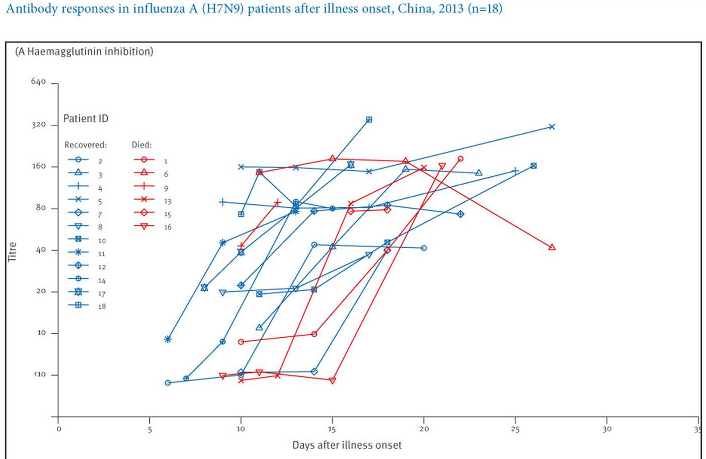
Instead, you need actual measurements using serum samples from people who are known to have been infected with H7N9 to tell you what your titers mean. Someone has to study a number of patients to see what their actual H7N9 antibody titers are, and then a mathematical analysis of that data is done to come up with a threshold titer value, above which serum samples can be said to have come from people infected with H7N9 with some large degree of certainty, and below which they are thought to have come from people who were not infected. We've seen almost no asymptomatic cases (cases with no symptoms), so we really can't say much about them. So we have to go with data from H7N9 patients who have had symptoms. Here's a great graph showing antibody titers, as measured using the HI assay, in serum samples from H7N9 patients:5

Figure 1. H7N9 HI
Euro Surveill. 2013 Dec 12;18(50):20657

As you can see in the graph above (Figure 1), by around 3 weeks after infection onset, all samples from patients whose HI titer was measured had titers 40.

The graph below (Figure 2), from a different study,4 shows that the HI titer for all H7N9 samples studied by this set of authors was also 40. In addition, this graph shows titers from "control" samples (i.e., samples from people who did not have H7N9 infections); all control samples had titers that were <40.

Figure 2: H7N9 IC50 HI4
Emerg Infect Dis. 2013 Oct;19(10):1685-7

Finally, below (Figure 3) is another nice graph, from a third study,6 showing anti-H7N9 antibody levels ("IgG"), "HI" assay results and MN assay ("NAb") results for several H7N9 patients, again showing that all samples from the H7N9 patients studied had HI titers 40. This graph also shows that all H7N9 patient serum samples had an MN titer of 20, if samples were taken after enough time had elapsed since their infections had started.

Figure 3. H7N9 IgG HI NAb.
Emerg Infect Dis. 2014 Feb;20(2):192-200

In other words, if an individual's anti-H7N9 antibody titer is 40 by the HI assay or 20 by the MN assay, these data suggest that we could pretty safely say that he or she has had a symptomatic H7N9 infection within the past few months, and if the HI or MN titers are below those cutoffs, then the individual probably hasn't had a symptomatic H7N9 infection. We don't know to what extent asymptomatic H7N9 infections will be captured by these cutoffs, but it is likely that some asymptomatic cases would be missed using these cutoffs. It is also possible that some mild infections could be missed using these cutoffs. However, it would be a great step forward just to get estimates of what percentages of any regional population or occupational group of people have had any kind of H7N9 infection. A comparison of antibody titers for asymptomatically infected and symptomatically infected H5N1 cases may be instructive when thinking about H7N9.7

WHO guidelines are even stricter than the cutoffs discussed in the paragraph above. WHO guidelines say that, using the HI assay, only single samples with titers of 160 can be considered "seropositive": "Paired sera (acute and convalescent sera) with a 4-fold rise in HI titer or single sera collected in convalescent phase with HI titer of ≥160 could be considered as H7N9 HI antibody positive. Sera with HI titer of 20-80 should be confirmed by MN or WB assay."1 For the MN assay, however, the WHO does not give specific cutoffs: "With single-serum samples, care must be taken in interpreting low titers such as 20 and 40. Generally, knowledge of the antibody titers in an age-matched control population is needed to determine the minimum titer that is indicative of a specific antibody response to the virus used in the assay."2

Now, it should be noted that WHO assay instructions recommend the use of horse red blood cells for the HI assay, and not everyone uses horse red blood cells. Some people use chicken, turkey, guinea pig or other kinds of red blood cells. That starts making comparisons between different groups' assays difficult. Horse red blood cells are better to use than turkey red blood cells for H7N9 because they have more a2,3-linked ("bird") sialic acids (influenza receptors); HI results are more sensitive with horse red blood cells. In other words, it may take less antibody in the assays to get the same result using horse red blood cells than it would using turkey red blood cells. This would translate into a higher number, when discussing H7N9 patient titers, for HI assays using horse red blood cells, compared to assays using turkey red blood cells. I have not seen direct comparisons of titers obtained using different types of red blood cells in HI assays specifically for H7N9, but the situation is probably similar to that for H5N1.8

Figures 1 and 3 above were made with HI data obtained using horse red blood cells. Figure 2 used guinea pig red blood cells. Are they completely comparable? No. Are they pretty comparable? Yes.

Are you getting a feeling for how complicated it is to interpret a seroprevalence paper? And for how difficult it is to compare results across studies?

Why does all of this matter?

It matters because some seroprevalence studies don't use appropriate cutoffs. And because it can be hard to determine even what an appropriate cutoff is when red blood cells from different species are used in an HI assay. This is where the reader has to be really careful. Cutoffs for seropositivity have been a big issue9 with H5N1 seroprevalence studies; some researchers have used cutoffs that were too low, and hence they have almost certainly overestimated how common H5N1-specific antibodies were in the populations studied.

So far, only one H7N9 serology paper published to date has reported probable seropositive samples, and this paper simply reported HI titers without using any specific threshold for seropositivity. Only one used study horse red blood cells in HI assays. The one paper that used an MN assay did use appropriate cutoffs. It should be noted that the new WHO HI guidelines were only published in December, 2013, after a couple of these papers were already published.

Here are the studies that have been published so far (I hope I haven't left any out):

  1. Bai et al.10 looked at serum samples collected before November, 2012 from poultry workers in eastern China and found no H7N9-positive samples. The study used HI and MN assays. Turkey red blood cells were used in the HI assay. Appropriate cutoffs were used for the MN assay.
  2. Hsieh et al.11 studied 14 close contacts of the first H7N9 case in Taiwan. The authors took blood samples within 18-28 days after the contacts' earliest exposures. The authors used an HI assay but not an MN assay. They used turkey red blood cells for the HI assay. They found all contacts to have an HI titer £10, and declared all to be seronegative. The HI titer for the H7N9 patient in their study was 1:80. These conclusions seem very sound.
  3. Yang et al.12 looked at serum samples from 1129 people from regions of China in which H7N9 cases had been seen, and from 396 poultry workers from 10 districts in which H7N9 cases had been seen. None of the samples from the general population was found to be seropositive, whereas >6% of the poultry workers were found to be seropositive. The authors also examined serum samples from several H7N9 patients. The study used an HI assay but not an MN assay. The authors used a cutoff of 80, along with turkey red blood cells, for the HI assay. Because the authors examined serum samples from H7N9 patients using their methods and got results that are reasonably similar to other results, their cutoffs are most likely reasonable, and their conclusions are probably quite sound. The authors report:
    • "Of the 1129 serum samples collected from individuals (age range, 1–88 years) in the general population, 9 (0.8%) had an HI titer of≥40 to influenza A(H7N9), but no serum samples with an HI titer of≥80 were found (Table 1). In contrast, among poultry workers, 13.9% (55/396) and 6.3% (25/396) had influenza A(H7N9) antibody titers of ≥40 and ≥80 (20 had an HI titer of 80, and 5 had an HI titer of 160), respectively."

      It is hard to imagine that an HI titer of 160 can be a spurious finding ("non-specific," to the initiated). Thus, these data strongly suggest that at least some H7N9 cases have been going undetected among poultry workers. Suppose we consider only the poultry workers with HI titer ≥80, or 6.3% of the poultry workers. If we then consider how many poultry workers there are, total, in districts from which H7N9 cases have emerged, then this study suggests that it's possible that quite a large number of poultry workers have been exposed to H7N9. Still, this study examined only a very small number of people, and we should be cautious about reading too much into these results.
  4. Qiu et al.13 looked at 3 H7N9 patients and 3 close household contacts of the patients who were exposed before infection control practices were put in place. The authors looked for viral RNA using a sensitive test (PCR) and examined serum samples drawn 15-26 days post-exposure using both an HI assay and a pseudovirus-based neutralization assay. They found no contacts to be seropositive. The H7N9 patients had HI titers that reached 160-640 during this time, and the patient contacts all had titers <10. The authors used horse red blood cells for the HI assay. These findings also seem sound.
To summarize, the conclusions from all of these papers do seem sound. But, it would be wise to keep all of these issues in mind as subsequent studies appear over time.

An additional study14looked at antibody titers in 1723 serum samples collected in Vietnam using a very different kind of assay (a protein microarray). Because seropositivity cutoff levels had not been determined with authors' assay methods using actual H7N9 patient samples, these authors were appropriately very careful not to attempt to draw any conclusions about H7N9 seroprevalence from their data:

"Because titers calculated from our assay are not directly comparable to HI or microneutralization tests, no cutoff is chosen to represent positivity or clinical protection. It is not possible to associate these titers with past exposure or past infection, as serological assays have not yet been validated for H7N9."

For the future

So, as new H7N9 serology studies gradually come out, you be the judge. Figure out whether they're believable or not. Ask yourself the following:
  1. What assay(s) were used? Did the authors use an MN assay? They get bonus points if they did. 
    • If only an HI assay was used, then the conclusions are slightly less certain than if an MN assay was used.
  2. If the authors used an HI assay, what species were the red blood cells from?
    • If horse red blood cells weren't used, then HI titer cutoffs lower than 160 are probably appropriate, but there is also more uncertainty about what an appropriate cutoff would be.
  3. What cutoff(s) did they use for seropositivity in their assay(s)? Do these cutoffs mesh with WHO guidelines? Do they mesh with what we know about H7N9 patient HI and MN antibody titers?
References
  1. http://www.who.int/influenza/gisrs_laboratory/cnic_serological_diagnosis_hai_a_h7n9_20131220.pdf
  2. http://www.who.int/influenza/gisrs_laboratory/cnic_serological_diagnosis_microneutralization_a_h7n9.pdf
  3. http://www.virology.ws/2009/05/27/influenza-hemagglutination-inhibition-assay/
  4. Qiu C, Huang Y, Zhang A, Tian D, Wan Y, Zhang X, Zhang W, Zhang Z, Yuan Z, Hu Y, Zhang X, Xu J. Safe pseudovirus-based assay for neutralization antibodies against influenza A(H7N9) virus. Emerg Infect Dis. 2013 Oct;19(10):1685-7
  5. Zhang A, Huang Y, Tian D, Lau EH, Wan Y, Liu X, Dong Y, Song Z, Zhang X, Zhang J, Bao M, Zhou M, Yuan S, Sun J, Zhu Z, Hu Y, Chen L, Leung CY, Wu JT, Zhang Z, Zhang X, Peiris JS, Xu J. Kinetics of serological responses in influenza A(H7N9)-infected patients correlate with clinical outcome in China, 2013. Euro Surveill. 2013 Dec 12;18(50):20657 
  6. Guo L, Zhang X, Ren L, Yu X, Chen L, Zhou H, Gao X, Teng Z, Li J, Hu J, Wu C, Xiao X, Zhu Y, Wang Q, Pang X, Jin Q, Wu F, Wang J. Human antibody responses to avian influenza A(H7N9) virus, 2013. Emerg Infect Dis. 2014 Feb;20(2):192-200
  7. Buchy P et al., PLoS One. 2010 May 27;5(5):e10864
  8. See, e.g., Table 4 in Pawar SD et al., Virol J. 2012 Oct 30;9:251
  9. Osterholm MT and Kelley NS, MBio. 2012 Feb 24;3(2):e00045-12
  10. Bai T et al., N Engl J Med. 2013 Jun 13;368(24):2339-40
  11. Hsieh SM et al., J Infect. 2013 Nov;67(5):494-5
  12. Yang S et al., J Infect Dis. 2014 Jan 15;209(2):265-9
  13. Qiu C et al., J Clin Virol. 2014 Feb;59(2):129-31
  14. Boni MF et al., J Infect Dis. 2013 Aug 15;208(4):554-8

NOTE: I did not have a hand in writing this post and thus take no credit for it. This was entirely the work of the Guest Writer. 

Sunday, March 23, 2014

Google Flu Trends: What did you expect?

I posted this on Crawford Kilian's H5N1 blog in response to his positing yet another story whacking Google Flu Trends for its "failure".

In case you can't tell - I'm a little sick of the number of electrons being wasted on writing the same thing about this paper in Science. I know, there is no shortage of electrons. Still, I hope to see this same degree of ire elicited by and directed toward other places, corporations and States who have trouble providing data to the public within the expected realms of accuracy. I'd also hope for more focus on what and how we test now and how representative that is of what a virus is doing; or what we might be missing.


I think Olson et al said it well when noting GFT's earlier failure to predict the H1N1 2009 pandemic's influenza-like illness activity..
"Current internet search query data are no substitute for timely local clinical and laboratory surveillance, or national surveillance based on local data collection"
The post...

Okay. Google Flu Trends (GFT) was not 100% accurate. Wow. Who'd would have thunk it? Who could possibly have guessed this would happen? The disappointment is clearly widespread. A predictive computer-based system set up for devising regulatory guidelines, formulating vaccine formulations, ensuring suitable laboratory testing capacity and preparation or national surveillance guidelines failed. Wait. What? It wasn't setup for any of that! It’s really just a pretty thing you can go look at to get an estimate of flu activity near you; much easier to wade through than some country's public health efforts. Estimate. When did we expect an estimate to be perfect?

Come on people-interpreting-this-paper. GFT isn't a failure unless you were honestly expecting it to be 100% correct.

Of course it couldn't ever be that. THERE. WAS. NO. VIRUS. TESTING. Not done by GFT anyway. Some lab testing went into it apparently, but even that was a sliver of a slice of a shard. And if you know anything about respiratory virus testing, then you know that even the testing we do, represents only a tiny fraction of the amount of virus-positive cases out there, extrapolating from those. That testing even varies from place-to-place in type, quantity and extent of reporting. The choice of what to test (sampling) is itself biased in a number of ways, not the least of which is that we favour testing pretty sick people or those that feel crook enough to present to a Doctor. We’re comparing GFT’s “fail” to an estimate. You’re all comfortable with using that to lambaste GFT? You’re comfortable to call that a total fail?

"The folks at Google figured that, with all their massive data, they could outsmart anyone."

Really? Is that what the folks thought? Did Google really get bitten by the flu bug?; can Google truly not track the flu? Certainly catchy headlines one and all. I guess no-one would read something entitled "Google Flu Trend's estimates not in agreement with some national testing data which also represents only a portion of those who get infected". I can see where that might not be a real mouse-wheel turner.

GFT was and could only ever be a predictive system. Just like that shiny App you have on your phone that predicts the weather forecast. Let's drag "big weather" through the interwebs flailing it at every turn so we can suitably express our righteous indignation at its failure to predict the rain we wanted on the weekend. It failed! OMG! Now I have to water my lawn to stop it from drying up. But that's all I have to do. No-one died when the clouds held their watery payload. My child was no more or less safe because the weather bug bit the Bureau of Meteorology here in Queensland. I didn’t have to get a new lawn because it is now 24-hours drier.

Does GFT's overestimate of the number of predicted cases by 0.5-2 fold (depending on the story you read) really have a real-world impact on anyone? Seriously? Keep in mind that its estimates still followed the trend of flu activity pretty closely; they peaked when actual flu was peaking, just not (my other estimates) perfectly. But apparently someone 100% concordance between lab sampling and GFT estimate data.

GFT has been doing a perfectly good job given what it is and what it could ever hope to be in its current setup. Perhaps centralizing and plotting the WORLD'S lab-based data alongside Google “flu”-related search-result data would be a useful next step for GFT. Then we could make up our own
minds.

In the meantime, keep it in context people.


References...

Tuesday, March 18, 2014

Any differences in the sex of avian influenza A(H7N9) virus cases in different areas of China?

a) Male (blue) and female (lavender) lab-confirmed H7N9 human cases broken into the Province or Municipality of likely acquisition. b) The proportion of total H7N9 positives at each site of acquisition that are female (lavender).  The proportion of females in Wave 1 (Range of weeks beginning 18-Feb-13 to 20-May-12) and Wave 2 (07-Oct-13:current) are also shown as a horizontal line for comparison.
Click on chart to enlarge.


This new chart idea was just a look-see at whether there is anything out of the ordinary about the sex distribution of H7N9 human cases in the different areas of China. These are total numbers from both Waves of H7N9 season.

I've included case numbers in Part a) as well as proportion of females in part b) to show that a value of 100% must be place in context of only 1 POS!

Nothing much to see here folks.


Monday, March 17, 2014

Influenza viruses in Queensland, Australia: 03-Mar-2014:09-2014.

Map of Queensland's Hospital and Health service
areas. Adapted from
http://www.health.qld.gov.au/maps/hhs_facilities.pdf.
Click on image to enlarge.
Sure enough, as promised on the 12-Mar, the new Queensland flu numbers are out (I post a week after the next new numbers come out publicly; its just the deal I have). So this follows on from last Wednesday.

This is the next week's numbers which follow on from my earlier post on the increased number of influenza cases and the media reports of influenza A(H1N1)pdm09 virus  predominance.

The Queensland Health Statewide Communicable Disease Surveillance Report for the week 03-Mar:09-Mar has some extra detail, this week. The extra detail outlines that most (860; 94%) of this year's 918 influenza notifications (2.3X the 5-year year-to-date mean value) to date are located in the following Hospital Health Service (HHS) areas (see the map above):
  • Metro South: 192 (21%)
  • Metro North: 176 (19%)
  • Gold Coast: 110 (12%)
  • Cairns and Hinterland: 106 (12%)
  • Townsville: 73 (8%)
  • Darling Downs: 52 (6%)
  • Sunshine Coast: 50 (5%)
  • Cape York: 46 (5%)
  • West Moreton: 28 (3%)
  • Mackay: 27 (3%)
The median age of cases is 41-years and 50% are male. The highest rate of notifications is in the 50-59-year age group at 24.8/100,000.

Percentages represent the proportion of all 80 
notifications for this reporting period.IFAV-Influenza A virus; IFBV-Influenza B virus.
Click on image to enlarge.
This report also has some typing (Flu A or B) and subtyping data (H3N2 or H1N1).

These data are very much appreciated  since this is ahead of the traditional "flu season" reports. 

Many thanks to all associated with the Communicable Diseases Unit, Queensland Health, for adding this detail in. 

The chart above makes it very clear that H1N1 dominates the Qld influenza landscape so far. Specifically...
  • 80 notifications with signs and symptoms during the reporting period
  • 68 were typed as influenza type A viruses (85%)
    • 13/14 were subtyped as H1N1 (pdm09 I presume; 93% of the FluAs that were subtyped)
    • 1/14 H3N2
  • 12 were typed as influenza type B viruses

Tuesday, March 11, 2014

Influenza in Queensland, Australia: 24-Feb-2014:03-Mar-2014.

Image adapted from Geoscience Australia,

The Australian Government.

Autumn is upon us as the temperatures drop and we've had several days of showery weather in Brisbane.

The Courier mail (and my local radio) media note that "swine flu" (H1N1pdm09 presumably) cases are dominating across Queensland in what may be an early flu season; 85% of notifications are influenza A virus subtypes, and "most" are the "H1N1 swine flu strain". That's the influenza A virus subtype which the northern hemisphere has been battling.


In the previous week's Queensland Health Statewide Communicable Disease Surveillance Report the higher than average number of influenza notification was apparent (unfortunately they don't carry subtyping data).


See my previous post on this uptick in 24-January ([2]; Summer down here). 

By higher, I mean that that there have been 2.4X more notifications in Queensland (840 year to date based on onset date; 85 cases in this reporting week) than the mean number over the past 5-years (the mean for the time period spanning 24-Feb to 02-Mar in the previous 5-year period is 348.8). In fact Queensland seems to be leading the pack for flu notifications this year to date.

This time in past years we have seen these notifications..
  • 840 case notifications in 2014
  • 516 cases by this time in 2013
  • 233 cases by this time in 2012
  • 820 cases by this time in 2011
  • 104 cases by this time in 2010
  • 71 cases by this time in 2009
...highlighting that there have been other large years, but also much smaller (testing bias perhaps?) tallies in other years.

Keeping in mind that these are total numbers, not proportions of samples tested. Presumably this is the basis for the media comments of an "early flue season". Cairns, Gold Coast, Logan and Moreton Bay public health unit areas are the source of notifications and it seems the more recent data add Townsville and Cape York as hotspots.

I guess the next publicly released QHSCDS Report will have these updated total numbers in it so stay tuned. 


At the end of the 2013 flu season, H1N1pdm09 comprised just 15% of all notifications (although most Flu As were untyped), <1% in 2012 [4]. Queensland followed New South Wales and Victoria in total laboratory-confirmed notifications for 2013 [4]. 2013 was a late-starting, shorter flu season compared to 2011 and 2012 [4].

Whatever the small details however - get that flu shot - it will be available from next week. An advertising campaign is about to kick off for flu vaccination but in the meantime have a chat with your GP about flu vaccination options. It really is worth preventing the severe disease, and sometimes fatal disease, that can come along with an influenza infection. Not just for you, but for your children, those around you who are pregnant, your partners and parents as well as for the wider community. 


This is one of the relatively few diseases we can attack with just a simple jab.


References...

  1. Queensland Health Statewide Communicable Disease Surveillance Report 3-Mar-2014
    http://www.health.qld.gov.au/ph/documents/cdb/weeklyrprt-140303.pdf
  2. Influenza in Queensland, Australia...
    http://virologydownunder.blogspot.com.au/2014/01/influenza-in-queensalnd-austraia.html
  3. Up to 85 per cent of current Queensland flu notifications are H1N1 swine flu
    http://www.couriermail.com.au/news/queensland/up-to-85-per-cent-of-current-queensland-flu-notifications-are-h1n1-swine-flu/story-fnihsrf2-1226851854384?from=public_rss
  4. Australian influenza report 2013 - 28 September to 11 October 2013 (#09/2013)
    https://www.health.gov.au/internet/main/publishing.nsf/Content/cda-surveil-ozflu-flucurr.htm